Is it 2013 Already?

Looks like it is time for another cycle of updates to our favorite programs/applications.  It was only a couple of months ago that I downloaded and started looking at SQL Server 2012.  Then there was the new PowerPivot 2012 download.  Then a few weeks ago, Microsoft made available the previews of Office 2013, SharePoint 2013 and related 2013 downloads.  Maybe Microsoft just wanted to get all of their products out before the end of the Mayan calendar, just in case.

With all these downloads, it is more like information overload.  So I spent some time reinstalling my test laptop with Window 8, SQL Server 2012 and Office 2013.  I had heard that Microsoft Excel 2013 had both PowerPivot and Power View built in.  When I first started Excel 2013 up, I did not see either, but after a short search on the Internet, I found that you have to activate the Add-ins.  Interestingly both PowerPivot and Power View are COM add-ins.

After activating them, I was able to open Excel and see the familiar tab for PowerPivot.  At first Power View still did not appear.  So I loaded an existing workbook that I had been using the PowerPivot 2012.  During the load, it said it had to upgrade the file.  Curious.  I’m going to have to go back and try that again.

After clicking through the ribbons to see what had changed, I ran across an icon in the Insert ribbon named Power View.  Upon clicking on it, it told me that I did not have the most recent version of Silverlight.  Interesting since I was running Windows 8.  Perhaps the install for Office 2013 should include the most recent version of Silverlight.  Obviously it did not.

After installing the latest version of Silverlight and rebooting my system, I was able to click on the icon Power View.  Using the Contoso 2012 data that I have been using in my recent Saturday blogs, I was able to create a couple of different Power View reports and charts, including the popular scatter chart with a time line to see how the information changes over time.

Another thing I noticed is that when I ‘converted’ my Contoso workbook from last Saturday with my KPI examples, I lost the KPI definitions.  The other measure calculations were still in the converted workbook, but I had to rebuild the KPI definitions.  Sounds like a possible bug.  You would think that PowerPivot 2012 downloaded for Excel 2010 would be compatible with Excel’s 2013 PowerPivot.  That is something else I will need to try again to see if I can reproduce it.

Anyway, I’m having too much fun playing with all of these new ‘toys’ to write more now.  Besides, I spent too much time over the weekend watching the Olympics, especially the opening ceremonies.  Awesome!  Just in case the Queen reads my blog I just want to say, ‘Jolly good show!’.  However, I’ll be sure to cover some of the things I find in these new 2013 releases in future blogs.

BTW, I’m writing this in Word 2013 running on Windows 8.  Did I mention that I really miss the Start menu button?  Anyway, c’ya next time.

PowerPivot KPIs – Part 3 of the PowerPivot 2012 Series

This week I look at creating KPIs in PowerPivot 2012.  KPIs are built using measures and in most cases, calculated measures that you define with DAX.  PowerPivot 2008 had the ability to create calculated measures as we saw several weeks ago when I created a calculated measure to display the distinct count rather than a simple count.  However, the calculated measures I will use here are a bit more difficult and show some of the additional power of DAX.  Remember PowerPivot does not evaluate calculated measures for every row in a table.  Rather, Excel only calculates the measures needed for display in a pivot table.

For this example, I’ll use the Contoso 2012 sample data that I used last week.  This time I will calculate KPI’s based on the growth of each individual product sales quantity.  Management has decided not to look at the growth in sales amount because price increases could indicate growth even when the quantities of a product sold actually decreased.

Open the Contoso 2012 data in Excel and navigate to the PowerPivot window. Click on the tab for the table where you want to add the measure, FactSales for this example.  In the Home ribbon, select the Calculation Area button in the View group if it is not already selected.  This action splits the screen into an upper portion that displays the table data and a lower portion that appears blank.  This lower portion is where you define measures in PowerPivot 2012 instead of in the Field List of the pivot page itself.  This means that the calculated measures are available in every table and chart that reference the table even though you have only defined the measure in only one place.

To create a new measure, click in any empty cell of this lower portion.  I generally place my calculated columns along the leftmost column, but there is nothing wrong with placing them under the primary column used in the calculation if that makes more sense to you.

After selecting the cell, the action moves to the equation bar at the top of the screen.  Begin defining the measure definition by entering the name of the calculated measure followed by the two characters ‘:=’. These characters tell Excel that you are defining a calculated measure.  In this case, I want to define my measure as the sum of the product quantities by product.  To do this I can use the CALCULATE() function along with the SUM() function.

The CALCULATE() function begins with a parameter that defines the calculation.  In my case, I want to sum SalesQuantity.  The second parameter defines over what attribute I want to sum SalesQuantity.  Here I will use ProductKey rather than Product Name just in case Product name is not unique across all Product Key values.  Therefore, my DAX expression for this measure is:

:= CALCULATE(SUM[SalesQuantity]), DimProduct[ProductKey])

Notice that I did not prefix the field [SalesQuantity] with a table name because this field is in the current table, but I did prefix [ProductKey] with the table name DimProduct because I was referencing another table.  The following figure shows this expression.

For this example, I want to compare the current sales with the sales from the prior quarter.  To do this, I can create another calculated measure defined as:

LastQtrQty = CALCULATE([CurrentProductQty], dateadd(DimDate[DateKey], -1, quarter)

Notice that this expression uses the DateAdd() function to calculate a date in the previous quarter from the current date by using the second parameter of -1 and the third parameter of ‘quarter’ to tell the function which dates should be filtered.

Ok, you might be asking how does [CurrentProductQty] know I wanted to sum the data by quarter?  Actually, it doesn’t, but when I build the pivot table, I will use the Calendar Quarter slicer to display the data by quarters.

Finally, I need a ratio to compare the current product quantity sold to the quantity sold from the last quarter to see growth.  I can do that with the following calculated measure.

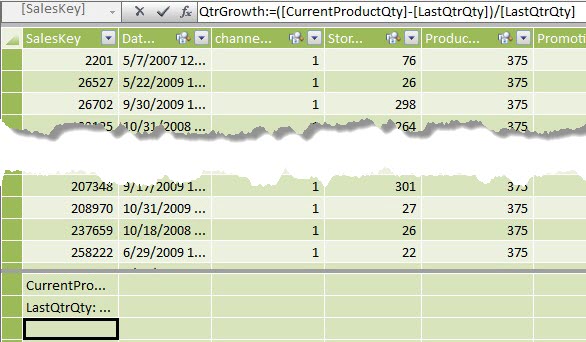
QtrGrowth = ([CurrentProductQty] – [LastQtrQty])/[LastQtrQty]

The following figure shows this calculated measure formula.  With this formula, a value of ‘0’ indicates no growth, but no loss. A negative value indicates that sales quantities have decreased, and a positive value indicates that sales growth has increased.

While I am in the PowerPivot window, I can tell Excel how to format these calculated measures.  As suggested earlier, defining the format of the measure here can save you time because the calculated measure can be used by any sheet in the current workbook that references the table.  Right click the measure and select Format to display the format dialog

In the Formatting dialog, I can select the field type category, and then the specific format definition.  In this case because I am talking about quantities, I will format the data using the Number category, the Decimal Number format, zero decimal places and the comma thousands separator for both of the quantity calculated measures.

For the growth rate, I am calculating a ratio and therefore want to select the Percentage format with 3 decimal places and I’ll ignore the 1000s separator.

The growth rate measure is also my KPI for this example.  When my ratio is less than zero (last quarter sales quantity is greater than this quarter sales quantity), I can say that sales of that product have decreased.  When my ratio is greater than zero (last quarter sales quantity is less than this quarter sales quantity), I can say that sales of that product have increased.  To define a KPI using the QtrGrowth measure, I need to right click the measure and select Create KPI from the popup menu.

In the Key Performance Indicator dialog, I need to define how I want to calculate the KPI.  First I need to decide whether I want to compare the current measure to another measure or to compare it to an absolute value.  In this case, I want to compare my growth rate to an absolute value and that value is zero.  Basically, values less than zero are bad and values greater than zero are good. However, I do not need to limit myself to an either/or comparison.  In fact, I may only want to flag decreases of more than 10% in the sales quantity as bad and to flag increases of more than 10% in the sales quantity as good.  Everything in between these two thresholds I will just label as satisfactory.

As you can see in the figure below, I defined the thresholds for bad and good data as -10% and 10% respectively.  Note that I represent 10% with the decimal value of 0.10.  I can also select one of four different range types.  By default, the dialog selects the range with the larger values representing good (red – yellow- green).  However, the range immediately below the default selection indicates that smaller values such as in golf are better (green-yellow-red).  I can also define KPIs in which central values are good or central values are bad.  These are represented by the sequence (red-yellow-green-yellow-red) and (green-yellow-red-yellow-green) respectively in the figure.

Beneath the definition of the status thresholds, I can select the display icon style.  The first seven styles have only three icons and should be used with the three area definitions while the three sets of five icons should be used with the five area definitions.  To make a selection, just click on the style.

There is also a section in the form for defining descriptions that can be expanded or collapsed as needed.  These definitions are optional and for now, I will skip over them.

After defining your KPI properties and clicking OK, you should see your calculated measure has a small green-yellow-red bar icon to the right as shown in the following figure to indicate that this measure defines a KPI.

I am now ready to build my pivot table using my new KPI calculations.  If I did not already have pivot table, I would begin by selecting PivotTable from the Home ribbon to create a pivot table.  If the pivot table already exists (as it does in my case), I can simply switch to the Excel pivot table sheet.  The PowerPivot Field List shows the message that the data has changed and prompts me to refresh which of course I will.  The PowerPivot Field List should now show my calculated measures in the table where I defined them, FactSales, in this example.  The following figure shows this updated Field List.

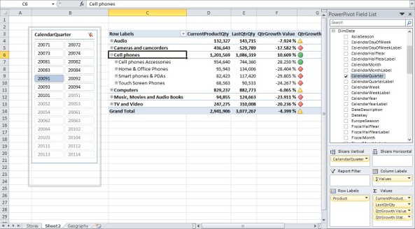
After selecting various columns for my Values, Row Labels, Column Labels and Slicer, I see data like in the following figure.

Note in this figure, I chose to display my three new calculated measures related to product sales quantity.  I am displaying the quantity sold in the current time period, the previous quarter and the growth as a percentage as well as the KPI indicator.  Of course you could just show the grow rate and KPI indicate if that is all you or management really wanted to see.

Because I want to see quantities by product, I select my product hierarchy that I created in last week’s blog as my row dimension.  Note that by using the product hierarchy, I can start by looking at sales quantities across an entire category and then drill down to see quantities sold by subcategory and even by product.  The pivot table automatically calculates the KPI at each hierarchy level making it easy to discover which products in the category contributed to the good or bad performance of that category.  (Similarly, I could define KPI values to calculate quantities or sales by store and region to determine which stores are doing well and which stores I might want to close.)

Oh, by the way, the trick, so to speak, to get the correct current period sales quantity was to use the field CalendarQuarter as a slicer for the pivot table and then selecting only a single quarter.  Therefore the current product quantity represents the sales for the selected quarter and the LastQtrQty represents the sales quantity for the product for the previous quarter.  If I wanted to compare sales quantity year by year, I would have CalendarYear as my slicer and defined my last period measure something like:

LastYrQty := CALCULATE([CurrentProductQty], dateadd(DimDate[DateKey], -1, year)

I’ll bet you can probably guess how to create a measure to compare product sales by month.

C’ya next time for more PowerPivot 2012 fun.


Imposters

Having a social media presence has been a rather divided topic between those who insist that an organization must have a social presence on the Internet, and those who believe that any effort spent in social media products like Facebook, Linkedin, or Twitter is just an excuse to waste time during corporate work hours.  The problem is that if you do not establish a social presence on these social media sites of the Internet for your organization, someone else might.

Remember that social media sites are designed around the ease of communication between the people who establish the site and their ‘audience’.  Most of these sites have no real security.  If a specific site name is not already in use, anyone can ‘adopt’ that name and create their own site and can begin posting information, blogs, tweets, etc as if they were the other organization they are impersonating.  There is no requirement to prove who you are when you establish the site.  It can take weeks and even months to ‘discover’ that someone has created a social media site and is using it to post information that to the average Internet user appears to be coming from you.

Impersonating another organization on a social media site is just one part of the problem.  Another problem occurs when they post information that can be damaging to the organization.  It is often difficult to track down who really runs the site although most of these social media hosts will quickly take down a site if you can prove to them that your organization did not actually create the site they host.  However, more damaging is the potential to post files containing viruses, Trojans, or key capture utilities in the guise of information about the organization.  (Do you remember the Koobface virus that hit Facebook back in 2008?)

There are some tools like LinkExtend that can help users determine what site a link will take them to and whether it is save, but this is only available for FireFox browsers and it is a manual process.  It is not automatic security.

The problem is that tools to hack into websites are too easy to find.  For example, Firesheep is a FireFox extension that uses packet sniffing to intercept unencrypted cookies from many social media sites such as Facebook and Twitter.  These cookies can be used to discover the identities of the site owners and then the user can take on the log-in credentials of the site user.  While using this type of software is legitimate if you want to assess your own site’s vulnerability, it is illegal to use this type of software on someone else’s site which falls under the wire-tapping laws in this country.   To counter ‘tools’ like Firesheep are products like BlackSheep from Zscaler which reportedly can identify networks where someone is using Firesheep.

The point is, whether you establish your own social media presence or try to hide your head in the sand and hope that social media will just go away, the problem is Pandora’s box has been opened and social media genie is here to stay.  Your job is trying to keep everything inside from escaping.  One way you can do that is to establish your own social media presence for your organization and then monitor and vigorously defend it if necessary.

C’ya next time.

Power Pivot Hierarchies – Part 2 of PowerPivot 2012 Series

Last time I introduced some of the new features in PowerPivot 2012.  This week I will continue to explore the new features in PowerPivot 2012 by looking at building hierarchies.

In the previous version of PowerPivot, I could drag multiple dimension attributes to the columns or rows of a pivot table to create a hierarchy on the fly.  I still can.  However, the latest version of PowerPivot lets me pre-define hierarchies that users are most likely to use.  Using the Contoso 2012 data sample , I’ll show you how to build a hierarchy for products starting with category and drilling down into subcategories and finally products themselves.  But first, let’s clean up the data in my model to streamline processing.

Open the Contoso 2012 data in PowerPivot 2012 from last week.  While I could manage the data from the traditional data view (tab view to some), the new diagram view is so much easier.  Click the Diagram View button in the View group of the Home ribbon.

Since I want to focus on the tables: DimProduct, DimProductSubCategory, and DimProductCategory, I reorganize the tables in the diagram view to bring them together as shown in the following figure.

Notice that by default, I loaded all fields in these tables.  However, many of these fields are not needed for my pivot table project.  I could go back and reload these tables and define which fields I wanted to load into my model.  A best practice is to review the data during load to select only the columns needed and to filter the rows for only the data needed.  While I can always filter later by using slicers to remove rows that I do not want, it places an extra burden on the pivot table user to know what slicers to apply.  Removing columns that I later decide that I do not need is a simpler process.  In fact, I have two options.  I can simply hide a column from the client tool (Excel pivot table) side or I can delete the column entirely.  Of course, hiding a column means that if I change my mind later, I can unhide the column and begin using it again.  Let’s see how these options work.

Suppose I decide that I may not need the StopSaleDate column in the DimProduct table.  Right click on the field to display the popup menu shown below and select the Hide from Client Tools.  This removes the column from the Field List when displaying the pivot table or chart, but does not remove the field from the model.  I use this option to hide columns that I use to build calculated columns but which the users do not need to use as dimensions or slicers.  Often I only need the calculated column and not the source fields used to build it.  However, those columns must remain in the model to support the calculation.  I just do not want to display them to the user.  Hiding the columns used in building calculated columns is often a best practice.

I can also hide multiple columns at once by clicking on the first field and then by holding down the Shift or Ctrl key, then clicking on other fields.  Using the Shift key lets me select a range by clicking on the first and last field in a contiguous range.  Using the Ctrl key lets me select individual fields that may not be adjacent.  Then with the fields selected, I can right click on any selected field and click Hide from Client Tools just as before.

On the other hand, if I want to permanently remove a column from the current model , I could select one or more fields, right click the selection, and click Delete from the popup menu as shown below.  Just remember that when you delete a column, the only way to get that column back is to reload the table unless it is a calculated column in the first place.

Note: Deleting a column from the model does not affect the source data.

The following figure shows my ‘cleaned’ set of product and category tables.  Notice also that I clicked on the arrow line that relates the DimProduct and DimProductSubCategory tables.  When I do that, PowerPivot highlights the fields involved in the relationship.

Now with my tables cleaned, I can return to the Data View and open the DimProduct table.  I need to add two fields to the product table to create the hierarchy for products.  The first field I want to add is the ProductSubCategoryName.  If you remember from some of my earlier posts, to add a column to a table, just navigate to the right side of the table and click Add Column to select a new column.  I will rename the column to something more appropriate like SubCategory, then apply the formula:

= RELATED(DimProductSubcatgory[ProductSubcategoryName])

I hope you remember that to reference a field in another table, you must use the RELATED() function.  The resulting column looks something like the following:

Similarly, I add a Category column and use the equation:

= RELATED(DimProductCatgory[ProductCategoryName])

Now I can return to the Diagram View.

I no longer need to display the DimProductSubcategory and DimProductCategory tables to the user because my product table now includes the information I need, the names of the product category and subcategory.  Therefore, I can right click on the header of each of these tables and select Hide from Client Tools from the popup menu.  These two tables will no longer appear in the Field List box of the pivot table.

Next, within the DimProduct table, I can right click on the field that forms the top level of the hierarchy, Category in this case, and select Create Hierarchy from the popup menu.

A default hierarchy named Hierarchy1 is added to the DimProduct table.  I’ll rename it later.  First, I’ll right click on SubCategory and select Add to Hierarchy.  The fly-out shows the names of all current hierarchies in the table.  Since I only have one, I can simply click Hierarchy1 to select it.

Similarly, I also add the field ProductName to the hierarchy as shown in the figure below.

I could hide these three fields from the Client View as described earlier by selecting them then right clicking on them and picking Hide from Client View in the popup menu.  However, I’ll tell you later why this might be a bad idea.

However, we do want to rename the hierarchy.  Right click the hierarchy name and select Rename from the popup menu.

If we now go to our Excel pivot table window and refresh the PowerPivot Fields List by clicking the Refresh button that automatically appears at the top of the list when Excel recognizes that something has changed in the underlying data, you should see something like the following figure.  Notice that DimProduct now includes an entry for the hierarchy which I’ve renamed to Product.

If I build a simple pivot table to sum the SalesAmount and use the Product hierarchy as my row dimension, the resulting pivot table should look like the following:

By clicking on the box before each of the tables, I can expand and collapse each level drilling down to the level of detail that I need.  If I right click on any of the levels, I can select an option to expand or collapse all of the members of that level at one time.

Ok, so what is the problem with removing the fields from DimProduct that appear in the hierarchy?  First, I cannot create a pivot table using one of the sublevels as a column or row.  For example, I cannot simply drag over SubCategory from the hierarchy list to be my row dimension.  That may be a minor issue compared to the second problem.  The big problem as I see it is that I cannot use Category or SubCategory as slicer fields if I remove the individual fields from DimProduct.  I cannot drag the individual field names from the hierarchy definition into the slicer boxes.  For that reason primarily, I prefer to keep the individual fields that define the hierarchy in the table in most cases.

That’s it for this week.  Next week I’ll look at some more exciting features from PowerPivot 2012.

C’ya next time.

Guide To Losing Your Best People

Most indications point to the fact that the economy is improving.  More importantly, jobs for IT are picking up again.  Even if you are not looking for a new job, and I’m not suggesting that you should, your co-workers may be enticed by some of the offers by other companies trying to ramp up for the next economic boom.  One way you can prepare for that possibility is to review the salary surveys conducted by many IT groups, magazines, and companies.  Information Week published one such survey just a few months ago.

Perhaps the most interesting part of these types of surveys is not just the salary amounts, but the respondent’s answers to questions like whether they are actively looking for a new job, why they are looking for a new job, and what matters most in a job.

Interestingly, most of the job seekers would actually prefer to stay where they are.  Not entirely surprising since change is not only traumatic, but the uncertainty of exchanging a known set of job related issues for an unknown set of job issues can be frightening.  So perhaps the real question that IT managers need to ask when looking at these surveys is what does it take to keep from losing your best talent.

No one should be surprised that the top reason people are looking for a new job, cited by over 70%, is salary.  With the economy being in a slump for the last several years, companies have been reluctant to offer much in terms of raises.  In fact, many companies have even lowered salaries.  Other companies have used the economy to squeeze more work out of few employees further exasperating the perceived salary shortfall.

Perhaps because many companies have fallen back on maintaining existing systems rather than exploring new systems the survey reports that half of all IT staff and over 40% of the management staff is also looking at new positions as a way to get involved in more interesting work or to gain more personal fulfillment.  Maintaining existing aging systems is not very fulfilling to top IT producers who pride themselves in implementing new solutions.  Greater responsibility and more job satisfaction also rank high as a reason many employees leave.  Of the active job seekers, 41% have a problem with the company’s management or culture.  Considering that corporate culture only made it to 19% in the list of what’s most important to employees, one has to wonder how bad the company culture has become to rank so highly for those looking to change jobs.  Maybe it is telling us that while corporate culture is usually not that important, when an employee finally decides to leave, the reason is often because the corporate culture has changed and not for the better. Perhaps this too is a recent effect caused by the pressures of the poor economy over the last several years.

Many job seekers complain that management does not appear to value their opinions and knowledge.  In fact, respect for the professionalism of the employee appears by the numbers to be more important than pay, work challenge, or company stability.  Perhaps this shift is reflective of the difference in attitudes about work attitudes between the baby boomers who as a whole were more company dedicated and the Gen X and Gen Y employees today that value the social and culture attitudes at work more and who respond more to recognition and appreciation for their work than to pay and benefits.

The problem may be more complex than a single simple answer.  Some staff may be looking to make up for lost time with little or even negative salary gains over the past several years.  Other staff members may be craving the challenge of working with the latest and greatest technology that your organization may just not be able to afford.

As a manager, many of these things are outside of your direct control.  You probably do not have control over salaries and your budget may prevent you from starting some of those interesting new projects that your staff yearns for.  You may be able to work with your HR department on some of these issues.  However, as a manager, there is one thing you do have control over.

Get to know your staff.  Find out what excites them about coming into work.  Praise them for their accomplishments, and not just to them, but also to others within the organization when the staff member is present so they know that you appreciate them.  On the other hand, if something does not work, or a project falls behind schedule, or perhaps must be cancelled, don’t criticize them in front of other staffers.  Remember my discussion on innovation and the statement that the most innovative organizations have an expected failure rate as part of the risk of achieving big successes.

Work with your staff to identify how you can help them reach success in their next project or task.  Try to determine what types of tasks each of your staff members enjoy the most and then try to move assignments around to give each of them tasks that excite them to perform to higher standards.  It may not always be possible to assign each staff member only the tasks they enjoy the most, but your staff will see and appreciate your attempts to do so.

Recognize their input and achievements.  Challenge them to become part of the solution for new projects and tasks rather than just delegating work down to them.  This means getting them involved in design and planning meetings with other departments and teams.  Finally, listen to their opinions.

Even if you do all of these things, there is no guarantee that your staff will always stay with you.  However, failure to do these things may be the best guide to losing your best people.  The choice is yours.

C’ya next time.

PowerPivot 2012, Part 1

With the release of SQL Server 2012, we also got a new version of PowerPivot for Excel.  There have been many features added, too many to cover in one sitting at least in any detail.

One of my favorites is the new diagram view that let you visually look at not only the tables that you are bringing into your solution, but also the relationships between those tables.  If you only work with a small number of tables, you may not appreciate the benefit this feature brings.  However, when you have models that include more than a half dozen tables or so, the diagram view of the tables helps visualize and understand the relations between them.  As I’ve often said in presentations, one of the keys to understanding your pivot table model is understanding the relations between the tables that make it up.  This capability has existed in SSAS, so I’m glad to see it brought to PowerPivot.

Another feature I really like is the Calculation Area that allows you view measures in a free form data grid.  This feature allows you to create, view, and otherwise manage your measures and Key Performance Indicators (KPIs).   Yes, KPIs are now a part of PowerPivot allowing you evaluate the performance of selected measures and display their status creating more of a BI dashboard feel for management to quickly determinate the status of the organization.  I will take a look at both of these new features in a future blog.

Perspectives, another SSAS feature now brought to PowerPivot, allows you to define a subset of a larger model to focus on specific area.  In addition, because a Perspective works with a subset of data, interaction and navigation with the data in the pivot table is enhanced.

One of my SQL Saturday presentations has been how to create a date table dimension from your existing fact tables.  In PowerPivot 2012, you can now mark this table specifically as a date table and take advantage of some built in Date Filters that were sadly missing from the earlier version of PowerPivot.  For example, you can now filter on dates after, before or between a date range.  In the past, you could do this only by creating additional calculated fields in your date table to identify which rows to use for special filters.  You no longer need these workarounds.  I’ll get back to this one in a minute.

A cool feature is the Show Details option that appears in the popup menu when you right-click in a pivot table cell.  It pops open a new spreadsheet that shows the underlying data used to create that cell.  This can be extremely useful for not only validating that pivot table, but also researching why specific cells in the pivot table have certain values.

There is a lot more, but I want to get into at least a small demo today of one of the features.  I am going to give you a look at using date tables and the built in filtering.  I’ll specially look at why you might want to use this feature.  Before we start, here are some of the pre-requisites for PowerPivot 2012.

If you already have PowerPivot for Excel 2010 installed on your machine, you can simply upgrade it using the .msi file from the PowerPivot Site.  If you have never used PowerPivot before, but you have Microsoft Office 2010 installed with Excel, you can install PowerPivot using the same .msi download.  There are two versions of PowerPivot 2012, just like in 2010.  There is a x86 version and a x64 version.  The version of Microsoft Office you have installed determines the version of PowerPivot 2012 you should use.  If you have the 64-bit version of Microsoft Office, you must use the x64 version of PowerPivot.  Similarly, the 32-bit version of Microsoft Office can only use the x86 (32-bit) version of PowerPivot.  The 64-bit version supports substantially larger pivot tables but if you are using the Data Mining Add-in for Excel, you must stay with the 32-bit version.  You also need Microsoft .NET Framework 4.0 and the Visual Studio 2010 Tools for Office Runtime and Office Shared Features.

Using the Contoso sample dataset for PowerPivot 2012 found here, I selected the DimDate table and then select Mark as Date Table from the Design ribbon as shown in the following figure.

A Date Table must have a column that is of the date data type and is unique for each record.  I happen to know that the DateKey field in DimDate fits this requirement.

Now when I build a pivot table and use data from the DimDate table (and it does not have to be the DateKey either.  It can be any of the dimension attributes.  I can use the dropdown menu associated with the field.  In the example below, I did use DateKey, but remember that it can be any attribute in the dimension.  In the menu is a new option: Date Filters.  Click on this field to display the fly-out menu.  From this menu, you select a variety of different date filter criteria.  Some of these will not work with the Contoso sample data because for some reason, Microsoft decided not to update the dates in the Contoso data set.  Therefore, filters like Tomorrow, Today, Yesterday, Next Week, etc. will have no meaning and will return no results.  However, we can use the Before, After or Between options.

One of the options near the bottom of the list also includes some interesting filters for dates within a quarter or month.  Feel free to try any of these filters on your own date data.

For the Contoso data, I chose the Between filter which prompts for the date range using the following dialog.

When you press OK, the resulting pivot table will only display data for that date range.  If you are displaying a date attribute like week or month, only the first couple of weeks in 2007 or the month of January in 2007 appear.

In the following figure, I am displaying sales by week beginning with the year 2007.  Suppose I wanted to see the details that make up the sales for the first week of the year.  Right click on the SalesAmount sum and from the popup menu, choose the new option Show Details as shown in the next figure.

This menu command opens a new sheet in the Excel workbook and displays all of the rows from FactSales for the first week of 2007.  You can review the data to evaluate why the sales for the first week appears lower than other weeks.

Before ending this week, return to the PowerPivot window and select the Diagram view from the Design ribbon as shown below.

The following diagram appears to show graphically the relations between the tables.  While not shown in this diagram, go ahead and right click on any of the relationship lines connecting any two tables.  The popup dialog has three options: Delete, Mark as Inactive, Edit Relationship.  The first option’s action is obvious, it deletes the relationship.  The second option is used when you have more than one relationship defined (I will talk about having multiple relations between tables in a future bog, but think of Fact Tables with multiple dates with each needing a relationship to the DimDate table.  Finally, the Edit Relationship option allows you to edit the relationship using the same dialog used when creating new relationships.

Well, I am going to stop there for today, but there are plenty of other new features in PowerPivot 2012 to cover in future blog entries.

Oh, one last thing.  If you open existing PowerPivot files from 2010 in 2012, PowerPivot 2012 automatically converts them to 2012.  That’s great, but you may want to keep a backup of the PowerPivot Excel file in 2010 for those users who have not yet upgraded.

C’ya next time.

Busy or Productive?

Whether at work or at home, just because you are busy does not mean that you are productive.  You can work a whole day on a task, but at the end of day feel like you did not accomplish anything.  You may even dread the thought of going back the next day to do more of the same thing.  Or perhaps you came home at the end of the day feeling like you are on top of the world and could accomplish anything.  Furthermore, you cannot wait to go back tomorrow and do it all over again.  Does that define the difference between busy and productive?  If so, what does that mean if you never feel productive, just busy?

There may be some truth to the statement that one person’s busy is another person’s productive day.  Some people just seem to like certain tasks and hate others.  Does that mean the difference is all in your head?  Perhaps to some extent that is true, but that is not the whole picture.  Let us look at some examples of tasks that may get classified as either busy work or productive work.

Suppose you are the manager at ACME Software Inc. and you have two forms that you need immediately.  You have one team of traditional web programmers who build pages with HTML, CSS and ASP.NET so you give one form to them.  You have a second team that has been responsible for building your internal employee intranet and collaboration sites using SharePoint.  You heard that they can use a tool called InfoPath to create forms so you give the second form to them.  Both groups start on their respective forms on the same day.

The SharePoint team builds their form, tests it, and deploys it to production by the end of the week.  The web programmers appear to be working just as hard but they do not deploy their finished and tested form until the middle of the next week.

Both teams were busy as far as you can tell, but you might think that the SharePoint team was more productive.  Were they really more productive because their skills were better or that they were better programmers, or were they more productive because the tools they used, InfoPath to design the form, SharePoint Designer to create the workflow, and SharePoint to deploy the finished form to the production intranet site, allowed them to appear to be more productive?  Experience is always a factor.  An experienced .NET development team could outperform a novice SharePoint team.  On the other hand, good productivity tools can go a long way toward improving the productivity of a developer at any level.  However, no productivity tool will improve productivity unless people receive training and have the time to learn how to use the tool, but that is another story.

So is productivity about the tools you use to get the job done?  Does getting the job done faster define productivity while other people without those teams are merely busy?

Let us look at two teams where each team over the past year has worked on 3 special ‘emergency’ projects for management.  In the case of the first team, while they completed all three projects, none of the three projects went into production.  In one case, the project kept changing every few days because there was no well define set of requirements when the project begin.  Management just assumed that making changes in the middle of the project could be easily managed by the team without affecting the delivery date which kept getting pushed back.  Another project did not go into production because even after it was completed, there was no executive sponsor to see that others in the organization actually used the new program instead of the old manual way of processing their data.  Finally, the third project died a slow lingering death when no one in management would take responsibility for the design and sign-off on the specifications.

The second team had projects in which all of the specifications for the project were clearly defined at the start of the project, management quickly signed off on the design, and when the project was complete, management required all company users to switch to the new programs to guarantee consistent and timely processing of the data.

Both teams were busy, but it might be argued that only the second team was productive.  In fact, at the end of the year, the first team was on the verge of falling apart.  Some of the team members had already transferred to other groups.  Others had left the company entirely.  They had been busy, but they did not feel that they had accomplished anything.  On the other hand, the second team is ‘pumped’ by being part of the successful implementation of their projects.  Some have even turned down job offers from other departments and other companies because they felt like they were really making a difference.  In fact, the second team looked forward to new requests for challenges from management while the first team viewed new requests as merely another task to keep them busy, but nothing to get excited about because probably no one will ever use it anyway.

Are you busy or are you productive?  If you do not go home at night feeling that you were productive today, what can you do to feel productive tomorrow?  If you are in management, how can you work better with your teams to insure that they feel like their work is a productive addition to the organization?  Remember the statement, “We work to live.  We do not live to work.”  If you do not feel productive at the end of the day or if your team does not feel productive, change something and keep changing things until you do.  Being busy is better than not being busy.  However, the satisfaction of feeling productive is much better than just feeling busy.  In the end, life is too short to be just busy.  Go out tomorrow and make a difference for your team and for yourself experiencing the satisfaction of being productive.

C’ya next time.

Using Attribute Relations in Your Dimensions – Dimensions Part 3

Over the last several weeks, I’ve taken you through the steps on how to build a basic cube in SQL Server Analysis Services (SSAS).  To do that, I’ve been using the Contoso Retail database to illustrate the concepts.  Today I will cover one last topic before taking a break from SSAS to cover some of the new features in PowerPivot 2012.  I will show you how to build an attribute hierarchy for one of the Contoso Dimensions.

If you have been following along you may say, “That’s no big deal.  I’ve been creating hierarchies from the very beginning by choosing two or more attributes from a dimension for the rows or columns.”  For example, you may have dragged Category over to the row label area of the cube to display sales by product category.  Then perhaps you dragged Subcategory over to the right of Category to create a simple hierarchy showing subcategory sales within each category.  Perhaps you even dragged Product to the right of Subcategory so users could drill down through the subcategory to see the individual product sales.

Yes, you did create a hierarchy. In this case, you created a natural hierarchy.  A natural hierarchy is one in which the order of the attributes really only makes sense when ordered one way.  In this case, subcategories exist within categories.  Categories do not exist within subcategories. Similarly, products exist within subcategories.  Subcategories do not exist within products.  Another good example of a natural hierarchy might be to begin with years and drill down to quarters, then months, and finally days of the year.  (Yes, it is possible that you may want to look at the sales for the fourth quarter across all of the years for which you have sales data, but that is a future discussion.)

Sometimes, it makes sense for the developer to predefine the hierarchy in the cube definition so that the user need drag only the hierarchy definition to the row or column of the table.  This insures that the user places the attributes in the correct order.  But that is not the only reason to predefine the attribute hierarchy.

By default, SSAS automatically relates every attribute in a dimension to the dimension key.  In the example above, that dimension key would be the Product ID.  Therefore, even subcategories are related to the appropriate Product ID.  Similarly, every category is related to its appropriate Product ID.  Suppose you wanted a sum of the sales for Recording pens, a subcategory of Contoso’s products.  SSAS can scan through the Contoso retail sales data for sales belonging to the Recording Pen subcategory and sum the values.  Similarly, if you wanted to know the total sales of audio products, SSAS can scan through the Contoso retail sales data summing sales where the product belonged to the product category, Audio.

While this method returns the correct answer, SSAS has is a faster method.  SSAS stores intermediate values of measures from the fact table by the dimensions defined in the cube.  In other words, it stores sums of sales by product ID if product ID is a dimension key.  However, it does not store intermediate values for other dimension attributes such as subcategory or category.  To get the sum of sales for categories, it adds the previously calculated sales for each product in the subcategory.  Similarly, to report the sales by category, it adds the sales for each product in the category.  You might ask, “Wouldn’t it be faster to just add the sales subtotals for the subcategories within the selected category?”  Yes it would, but without defining attribute relationships, SSAS does not make these pre-calculated values available.  Granted, for the size of the Contoso Retail cube, this difference in how long it takes to calculate values for higher level groups in a hierarchy may be insignificant.  On the other hand, if you have a large cube with millions of rows of data, this difference can become significant.  Therefore, let’s see how to build hierarchies after defining Attribute Relationships.

To begin, open the Date dimension and click on the Dimension Structure tab.  Drag the fields you want to use as attributes from the Data Source View to the Attributes panel.  Note that you do not have to include all attributes.  In fact, the larger your database, the more selective of the attributes you will want to be in order to maintain good performance.  The following figure shows the selection of attributes I decided to include in my Date dimension.

Next, click on the Attribute Relationships tab at the top of the screen.  This shows the three panels shown in the next figure.  The top panel graphically displays the currently relationships.  Of course initially, there are no relationships defined between the attributes of the Date dimension.  In fact, we can see this by looking at the panel in the lower right which shows that the field Date, which is the key field, is related to all the fields in the dimension.  Furthermore, SSAS defines this relationship by default as a many-to-one relationship.  In other words, there are many dates within each Calendar Month, Calendar Quarter, Calendar Year and all of the other fields.

Displaying key values are often not very user friendly.  That is why most key values also have a corresponding description field that contains a user friendly description.  In this step, I will associate an attribute label with the attribute key value for each month, quarter, and year field by using the Name Column property.  We covered this topic on June 23rd in Customizing a Dimension.  Be sure to also set the Order By attribute to use the Name property, not the Key, AttributeKey, or AttributeName property.  (Note, that while using the Name property for Year, you may not always want to do this such as when displaying month names.  In that case, you may still want to sort by the column key value which typically is a numeric value for the month with January corresponding to “1”.)    You can change the field Type property to one of the date types to help SSAS understand how to aggregate the data.

When you are done, the main panel of the Attribute Relationship tab page shows the main attribute values with blue underlines beneath their names.  This indicates that SSAS is expected an attribute relationship to be associated with these fields, but that relationship has not yet been defined.

Before, defining those relationships, let’s remove the label columns as attributes since we will no longer need them to be displayed as separate attributes in the dimension.  Remember we just defined each the other key attributes to use a label as an alias value when displayed in the cube. You don’t want to confuse users by having two separate attributes within a dimension that both appear to add the same filter to the cube.  Select each label attribute previously added.  Right click on any of the selected items and choose Delete from the popup menu to remove them

We now have a clean list of attributes and can update the attribute relationships instead of defaulting to relating everything to the date key.

Right click on an attribute in the attributes list.  I generally work the hierarchy from the lowest level (most detailed attribute) to the top level.  Therefore, in this case, I’ll begin with Calendar Month because the attribute relationship between Date and Calendar month already exists.  When I right-click on Calendar Month and select new Attribute Relationship from the popup menu, the Create Attribute Relationship dialog appears (if you go back and edit the relationship later, it will say Edit Attribute Relationship, but it is the same dialog) and automatically puts CalendarMonth in the Source Attribute field.  Select Calendar Quarter as the Related Attribute.  The Relationship type can be either Flexible or Rigid.  In this case, we can say that the relationship between months and quarters is fixed and will never change and select Rigid.  (Products might get moved to a different subcategory occasionally and should therefore by defined as relationship type flexible.)
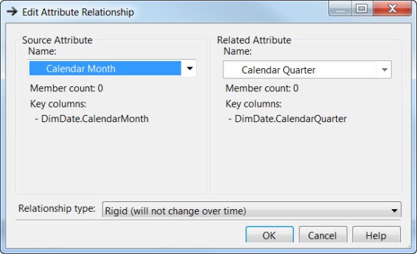
Click OK to complete the attribute relationship.  Then define a similar attribute relationship between Calendar Quarter and Calendar Year, Fiscal Month and Fiscal Quarter, and Fiscal Quarter and Fiscal Year.  When you have completed these attribute relationships, the top panel should visually display the relationships as in the following figure.  Note also that the Attribute Relations panel has also been updated to not only show our new relationships, but to also remove the unnecessary relationships from the Date field.

Next, return to the Dimension Structure tab.  Select Calendar Year (the top level of the calendar date hierarchy) and drag it into the center Hierarchies panel.  This will begin a new hierarchy definition.  Next select and drag Calendar Quarter to a spot beneath Calendar Year where it says <new Level>.  Similarly drag over Calendar Month and Date.  Finally, right-click on the title bar of the hierarchy and select Rename from the menu that appears.  Change the name from the generic Hierarchy to Calendar.

Similarly, create a second hierarchy by dragging Fiscal Year over from the Attributes panel to the Hierarchies panel, but below the Calendar hierarchy.  As done above, drag over Fiscal Quarter, Fiscal Month, and Date to the new hierarchy definition.  Change the name of this hierarchy from Hierarchy to Fiscal.

Next I recommend saving all the changes made so far by click the Save All button in the SSAS main menu or by selecting Save All in the File dropdown menu.

Next I must reprocess the Date dimension because of these changes.  The Process button is in the menu bar of both the Dimension Structure and the Attribute Relation tab page.  Click Run and wait a few moments for the processing to complete.

Close the Process Progress and Process Dimension dialogs when they complete.  Just to make sure that I did not miss anything, I rebuild and deploy the cube definition.  As we saw in an earlier blog, you should see the message Deployment Completed Successfully in the Status area in the lower right of the screen.

Finally, open the cube by double clicking on the cube name in the Solution Explorer panel.  Before you can use the new cube data, you will need to click the Reconnect button found in the menu bar of the Browser tab page.

Again a few seconds could pass until this process completes.  Now you should see an updated Dim Date dimension list long with right side of the page.  Notice the two new entries, Calendar and Fiscal, at the bottom of the list with the pyramid shaped stack of blue boxes.  This indicates that these hierarchies are pre-defined hierarchies that are ready to use.

If I drag Calendar to the Row Fields area and place Sales Amount in the Detail Fields area, I can see sales by year.

Also notice the box with the plus sign before each of the year labels.  I can click on plus sign to drill down into calendar year to display first quarters, then months, and finally days within each month.  The following figure shows some of the drill down options to calculate Sales Amounts.

Note, I could also open the hierarchy on the left side and select calendar quarter instead of the attribute with the rectangular set of blue boxes and drag Calendar Quarters directly to the Row Fields area.  Doing this uses the predefine calendar quarter summary data that the cube now has.  It also automatically includes the rest of the hierarchy (months and days) should I want to drill down further.

Sorry, this was rather long, but I wanted to reach a good stopping point in this discussion.

C’ya next time when I take a look at PowerPivot 2012.

WWJD?

What Would Jefferson Do?  Today is the day before the 4th of July.  Yes, every country in the world has a 4th of July.  However, in America it is a special day that represents the signing of the Declaration of Independence. Therefore, I have to wonder if Thomas Jefferson and the other founding fathers of this country were alive today, would they be proud of what has happened since they risked their lives by signing that document, or would they hang their heads in shame over what they saw has become of their great experiment. 

Of course, it is impossible to ask them, but we can ask ourselves.  Yes, we have made great technological achievements over those two hundred years, even to the point of landing a man on the moon, which would make Benjamin Franklin proud.  We have also made great strides in improving human rights and dignity, but we still have some ways to go.  We have become a major player in world politics and the world economy, a leader amongst nations.  However, there are cracks forming in the walls.  In fact, Jefferson warned of the dangers of these cracks in the following quote:

“I predict future happiness for Americans if they can prevent the government from wasting the labors of the people under the pretense of taking care of them.”

I wonder what he would say about the national debt?  Maybe it would be something like:

“Never spend your money before you have earned it.”

You see, Jefferson and most of the founding fathers believed in minimal government interference.  That was their definition of independence and freedom.  Today however, we see the government wanting to regulate every aspect of our lives.  Just one example is when the government decides whether a person can say a prayer or not say a prayer.  That type of interference is exactly what Jefferson warned about in these quotes:

“It does me no injury for my neighbor to say there are twenty gods or no God.”

 “I never will, by any word or act, bow to the shrine of intolerance or admit a right of inquiry into the religious opinions of others.”

Of course, Jefferson was a realist and in writing the Declaration of Independence knew that changes would occur.  He knew that the natural tendency for humans is to use power to dominate other humans and the only way to prevent that was through knowledge and the use of checks and balances throughout government to prevent that concentration of power:

“Experience hath shewn, that even under the best forms (of government) those entrusted with power have, in time, and by slow operations, perverted it into tyranny”

However, he had faith that the people could prevent that from happening if only they remain attentive to what was happening in government and kept the ideals of the founding fathers alive.

 “If once the people become inattentive to the public affairs, you and I, and Congress and Assemblies, Judges and Governors, shall all become wolves. It seems to be the law of our general nature, in spite of individual exceptions.”

In fact, he had faith that no matter what happened, the people, as long as they are well informed, would eventually right any abuses of power in the government as shown in this quote:

“Whenever the people are well informed, they can be trusted with their own government; that whenever things get so far wrong as to attract their notice, they may be relied on to set them to rights.”

Are you well informed?  This is an election year.  Do you just listen to the political ads on the TV where each candidate criticizes the integrity of the other?  To that, Jefferson might say:

“He who knows nothing is closer to the truth than he whose mind is filled with falsehoods and errors”

This process is nothing new and if you think the mud slinging is bad now, go back and read the Federalist papers.  Nevertheless, perhaps the main difference between politics of Jefferson’s day and today is that the Jefferson politics were not about making a name for themselves.  In fact, Jefferson never took it personally.

“I never considered a difference of opinion in politics, in religion, in philosophy, as cause for withdrawing from a friend.”

These unique Americans were idealists in some ways with a passion for the country they created.  Passion is not necessarily a bad thing when directed toward achieving higher goals.  In fact, I would suggest that a politician without passion for his beliefs has no beliefs at all and will readily change his or her position to match the political winds of their electing public.

Few people today understand what the original founding fathers really stood for.  So with tomorrow being the anniversary of the 4th of July especially this year being an election year, it might be a good time to reflect on what Jefferson and his colleagues believed in and whether any of the current politicians come close to representing that ideal.  Even Bill Clinton once said of Thomas Jefferson:

“If Thomas Jefferson were alive today, I would appoint him secretary of state, and then Al Gore and I would resign so he could become president.

Happy 4th of July and remember to think WWJD.

C’ya next time.