Exploring the World of Bias – Episode 4: Insignificance

The Bias of Insignificance

I have always had an interest in astronomy since the first time I looked up at the stars at night. They fascinated me. I almost thought I could ‘feel’ the depth of the Universe when looking up and imagined small we were in comparison. So, today I want to explore the Bias of Insignificance. I’ll try to keep this short, but the implications could be huge.

The bias of insignificance is the belief that everything around us, events, people, places, and actions are of little to no importance. For some people, this realization could lead to depression as they feel that no matter what they do, the result is insignificant in the grand scheme of things. What do I mean by that?

At one time in history, humanity believed that they were the center of the universe and all the planets, the moon, the sun, and even the stars revolved around us. Then some astronomers like Copernicus came up with a different idea, one that placed the sun at the center of the universe that we revolved around. Actually, that is not quite fair because a Greek astronomer Aristarchus of Samos in the third century BC proposed that the Earth revolved around the sun. Even he was only responding to an earlier philosopher named Philolaus of Croton. The problem is that whoever came up with the concept, it did not end there.

We know for certain that we are on the third planet around a non-descript G-type star which has a total of 8 planets that revolve around it (after demoting Pluto), 9 recognized dwarf planets, more than 650 natural satellites and still counting, and probably over a million asteroids, comets, and debris left over from the creation of this solar system. I won’t even go into the current estimates of man-made satellites we have placed in orbit (Elon Musk keeps adding to that number), rocket casings, dead satellites, and debris circling the Earth right now and posing a hazard to manned space flight and the International Space Station. Yes, humans tend to leave their garbage everywhere they go. Perhaps the best way to find life in the Universe is to look for big garbage dumps.

Our solar system is just one of about 300 million (the number varies from 100 to 400 million) star systems in our spiral arm galaxy known as the Milky Way. But we are nowhere near the center of that either. In fact, we are about 25,000 light years from the center which is about halfway from the center to the rim. We are not even in one of the spiral arms currently. We are in a little side spur called the Orion Spur between the Sagittarius and Perseus arms. Perhaps that is why some people believe we are isolated on a prison planet, or at the very least it explains why aliens do not go out of their way to contact us.

So, we are nowhere near the center of our galaxy. There are other nearby galaxies like Andromeda (M31) which is at least twice the diameter of the Milky Way and is estimated to

have about one billion stars. It is a mere 2.5 million light-years away, and in 4.5 billion years, astronomers estimate that we will collide with it. Why would we collide with it? Well, together with Andromeda and Triangulum (M33) and about 80 other smaller galaxies mutual gravity has formed what we call the local group.

Then about ten years ago, astronomers determined that our local group of galaxies was part of a larger supercluster of about 100,000 galaxies which they named Laniakea which spans an area of a little more than 500 million light-years in diameter. Are you feeling insignificant yet?

Well, astronomers are still not done. They now believe that Laniakea is just a filament in an even larger structure. Altogether, the Universe as currently envisioned by astronomers may have over 200 billion galaxies. Each has an average of 100 million stars. If only one in a hundred stars had an Earth-sized planet in the habitable zone and only one in a hundred of these had life and if only one in a hundred of these had intelligent life and if only one in a hundred of these were alive at this moment, that would still leave over 200 billion planets in the Universe with intelligent life.

Are you feeling insignificant now? Maybe even a little humbled?

While we may be insignificant on the scale of the Universe, maybe that causes you to reconsider just how inconsequential our political and national quarrels are or even how little difference various religious beliefs make in the grand view of the Universe. Yet how often do they seem to be the only thing that matters? Because for most of us, they do. Maybe that is the real test of our existence and intelligence to see how we handle the bias of being insignificant while we continue to make a difference right here, right now.

By sharepointmike Posted in Bias Tagged

Exploring the World of Bias – Episode 3: Normalcy

Normalcy Bias

Just what is normalcy bias? Normalcy bias is also referred to as cognitive bias. Perhaps that does not help you understand what it is. Well, in simple terms, it is when most people resist change, especially change that appears adverse or threatening. For most people, normalcy bias is, well, normal.

For example, many people invest in the stock market because they see specific stocks (or the entire market) going up for so long that because of FOMO (Fear Of Missing Out), they decide to invest. They want to be part of that upward trend which they see as the normal path of stocks at that moment. So, they buy right before a major correction or a stock sell-off. Then they fear that the stock of that company is doomed and will never recover (negative normalcy?) and sell their holdings at a loss. They may even exit the stock market never to go back, giving in to their normal tendency to avoid uncertainty, and put their money back in banks at 1% interest where they feel it is safe. Another example might be the employee who thinks that their company will never lay people off because they never have in the past. But the company is now facing hard economic times. What do they do? Or how about those who resist an evacuation order due to a pending hurricane because they always were able to ride out the storms in the past? Or how about the thought that climate change cannot be real because it always feels hotter in the summer after a cold winter (or vice versa)? That is only normal right? The denial of any change in the face of facts (at least as perceived by others) is a normalcy bias.

While it may not be reasonable to cling to unchanging normalcy, it is reasonable to question change. In that company stock’s case, did the stock go down (or up) because of something inherent in what the company is doing or is it part of a seasonal sales cycle or perhaps a change in the Fed’s interest rate policy? Factors outside of the company must be evaluated differently than internal factors. Is the company laying off people because the business they were in has changed (no one is buying horseshoes for their horses anymore) and they have not changed to meet the new challenges? Is that summer heat wave or winter cold spell a one-off weather event, or can you plot historically a change in the client that spans many years?

Normalcy is relative to one’s perception of the underlying factors that influence the thing being observed. Is the call of workers back into the office normal because that is the way work has always been done in that industry. But is it the only way or is there a bias against remote work because it is just something that management does not understand or trust. So, they want things to return to normal. There was a time when people who wanted to communicate with each other had to do it face-to-face. That was normal. Then the telephone was invented so you could talk remotely to others without needing to go to see them. Some people did not consider that normal and resisted it. However, it did not take long before they placed a telephone on every desk in an office, so you no longer needed to get up from your desk and walk ten feet down to a co-worker’s office to talk with them. Just pick up the phone. That became the new normal. More recently, people have switched to texting on cell phones. You now can see people out to lunch with each other sitting around a table texting with each other rather than simply talking to the person on the other side of the table. If in the future, you could add telepresence to show holographic images of the people sitting around a table having lunch or a meeting to discuss the latest project, would you still require people to be in the same room? The same building? The same city? The same country? So, what is normal? Does every change face some degree of normalcy bias until a majority of people accept it?

Today we live in a world in which there are not just one or two conflicts between nations, political campaigns, religious groups, or other groups going at each other at the same time. Have we become so accustomed to these conflicts that when another arises, it feels like it is just one more group fighting one other group. The thought being that they are not like me and therefore they are not normal. Is that the dark side of normalcy bias?

What are the phases of normalcy bias? Typically, normalcy bias begins with denial. That new virus is probably just like the flu and nothing to worry about. Then comes deliberation as different groups argue whether the virus was naturally occurring or whether it was manufactured by an enemy and if we all just stay at home, it will simply go away. Then the time comes when decisive action is needed. Vaccines are developed and made available to combat the virus. Or to take another look at the previous stock market example when the stock of a company begins to plummet. First, you cannot believe that the stock price has dropped by 25% in one day. There must be a mistake. Then you hear different analysts report their reasons why that stock price change was due to poor management decisions, market conditions, temporary pullbacks of that over inflated market segment, or outside political or economic factors. The stock had been going up for a year. Should you sell just because of one bad day, granted a very bad day. Will the stock price return to ‘normal’ if you just hold it? You must decide whether to hold onto the stock and ride out the downturn, to aggressively buy the dip in the hope of making a profit on the rebound, or to dump the stock and look toward other companies that are faring better.

The point I want to make here is that while Normalcy bias begins with the denial of a change in the status quo, It is important to quickly analyze the reasons why the normal has changed and then to take decisive action to meet those changes. Otherwise, normalcy bias can get you stuck in the past thinking that things will just go back to the way they used to be. While sometimes they will, often they do not. Many people believe today that when we beat inflation, prices will go back to the levels we had two years ago because that was normal. My personal opinion is that it is probably not going to happen. Prices may stop rising as quickly as they did, but other than a few commondities, prices overall they will never go back down again. You can forget about that $0.15 hamburger.

Or is that just another Normalcy Bias?

By sharepointmike Posted in Bias Tagged

Exploring the World of Bias – Episode 2: Anthropomorphism

Today, I am going to look at something called anthropomorphism. That big word refers to the fact that we humans often attribute human-like traits, emotions, and reactions to non-human objects, animals, natural phenomena, and potentially even aliens. Now that I have your attention, let us start with some of the more obvious examples.

Many of us have pets, and while the most common are cats and dogs, what I am about to suggest applies to other types of pets as well, but let’s stick to cats and dogs. Most pet owners love their animals. That is fine, but when you start to believe that your pets love you back, you are projecting human emotions into another species that may or may not have the same emotions. That is anthropomorphism.

Take the example of a dog. Does a dog return the love to its owner that its owner feels toward it? Or perhaps the dog merely uses a learned trait to protect its needs. Suppose a dog only thinks in terms of food, shelter, and safety. Does the dog recognize that it gets those needs satisfied by its owner? Will it therefore emulate the behavior that it has learned that will ensure those benefits keep coming? Will it even go so far as to defend its owner from an attack to ensure the future of those benefits? We might call the dog’s actions loyalty, but could it be merely trying to protect those three basic needs?

What about a child’s stuffed animals? Have you ever noticed how stuffed animals tend to have what most humans would consider to be happy faces? Would a child play with a stuffed animal that looked mean and grumpy given a choice? Have you ever seen a child playing with their stuffed animals placing them in chairs around a table having afternoon tea or perhaps a pretend meal? Simply look at all the non-human cartoon characters and how they are portrayed as if they had human-like lives with cars, houses, jobs, etc.

What about those adult toys like computers and robots? Don’t many people assume that they have real minds and can think? In the past, computers were simply viewed as creatively designed calculating machines. But in today’s world, the introduction and advancement of AI (Artificial Intelligence), is starting to blur the distinction between machines that simply perform basic calculations and those that can think. No, I do not believe that we have reached the singularity yet when computers surpass humans in the ability to think. But many people fear the possibility that a machine that can think might decide that it is superior to mere “bags of mostly water” (as stated in an early Star Trek episode). What if it feels threatened by humans (another anthropomorphism) and decides to eliminate that threat? This concept has been present in many science fiction stories in the past 100 years.

But even if we name our robot housekeeper, Rosie, or give names to our autonomous driving cars (wait, don’t we already give our cars names?), we should remember that they are merely following the path defined by a series of algorithms. They cannot create new ones. At least we don’t think so. A robot designed to clean a house cannot simply walk out and look for a new ‘job’ designing nuclear power plants or spaceships.

We currently use robots to explore the other planets in the solar system and beyond. These robots have names too like Curiosity, Galileo, Voyager, and others. Compared to the potential of the human mind, they are very simple. They cannot deal with anything strange or unexpected. If one of their cameras were to spot an alien spacecraft sitting on the ground or in the distance, it could not decide to alter its trajectory to check it out without human intervention. That is the human trait of curiosity. But could a trait like curiosity even be programmed into a robot? Could it, upon seeing something that it does not recognize, change its course and programming to investigate the unknown but interesting object that was not in its database? Potentially at some point in the future the answer to that question will be, Yes!

That brings me to the question of UFOs or UAPs if you prefer the government’s new term. Could they be merely advanced robots investigating strange new life forms? Remember that our solar system is young at a mere 4.5 billion years old while we believe the universe is estimated to be 13.8 billion years old. Considering how quickly our civilization has gone from stone tools to spaceships to the moon and beyond and from slide rules to calculators that are part of your phone which by the way fits into your pocket, is it possible that older civilizations in our galaxy have developed advanced technologies that to us would appear to be Magic? Could they have advanced robots that would appear to be alive performing basic exploration throughout the galaxy looking for life forms that are on the brink of space travel or of destroying themselves? Do they intend to destroy us, enslave us, save us, eat us? Those are a bias of anthropomorphism because that is what humans might do, have done in the past, when exploring new lands (well, maybe not the eat them part). Maybe if aliens existed, their motivation would be entirely different from anything we could think of.

The point of all this is simply that we humans tend to project our traits into everything we encounter whether it applies or not. It may be the rare scientist who can set all of their biases aside to study something without projecting human traits onto it. Think of that the next time you are looking deep into the eyes of your pet and wonder if it might be thinking that it loves you when it is just thinking, “Do you have anything for me to eat?”

Thanks for reading this and next time, perhaps, we will take on another different type of bias. (Or is that expectation in itself just another bias?) We shall see.

By sharepointmike Posted in Bias

Exploring The World of Bias – Episode 1

Since my retirement a few years ago, I have focused on two primary topics of interest. One is to make more people aware of ADA concerns ranging from website issues to local government road signs with poor color contrast. The second is to look into the many ways that bias exists in everything. I have given talks on both of these topics at SQL Saturday and Code Camp events many times over this period. However, I feel the need to reach out to more people. Although I have written about bias in the past, this begins the start of a new blog series on bias in today’s world.

Bias in the Astrophysics World

First, some background. On January 8, 2014, a meteorite CNEOS 20140108 (CNEOS stands for Center for Near-Earth Object Studies) struck the Earth near the northeast coast of Papua, New Guinea. It was confirmed to be the first known interstellar meteorite to strike the Earth. However, some believe that it could have been of extraterrestrial origin.

While the meteorite broke up in the atmosphere, pieces were suspected to have rained down into the ocean. In 2022, the Department of Defense (DOD) confirmed that the meteorite was most likely of interstellar origin. How did the DOD get involved you ask? Most likely, it was the new Space Force Command which is tasked with tracking anything entering the Earth’s atmosphere that might pose a threat such as a missile, a falling satellite, or yes, a meteorite. An initial path was plotted to indicate where the debris of the meteorite may have fallen.

A study conducted by John Hopkins University suggested that the reported path of the meteorite and thus the location of its fall may have been wrong based on the fact that the seismic evidence recorded on Manus Island may have only been triggered by a truck on a nearby road. Seismic evidence from a meteorite that probably never hit the Earth, but exploded in the air you might ask?

It is feasible to assume that meteorites explode in the atmosphere with a force as great as the Hiroshima atomic bomb. While most meteorites that explode upon hitting the atmosphere go largely unnoticed because the Earth’s surface is mostly water, electronic detection is increasingly likely as our monitoring systems become more sensitive. Such an explosion of a meteorite would generate a large flash and create a line of debris in the direction in which the meteorite was moving. Not only can the explosion potentially be detected, but it is believed that we have the potential to hear larger objects as strike they the water. Gemini 5 in 1965 splashed down nearly 90 miles away from its intended site, but it was reportedly ‘heard’ by sensitive sonar stations designed to listen for enemy submarines. I would imagine that in the 50+ years since then, our sensors have become significantly better.

In the summer of 2023, Avi Loeb, a professor at Harvard specializing in astrophysics and cosmology led an expedition to try to find fragments of the meteorite off the ocean floor. Dr. Loeb is best known for the 2018 theory he proposed that an object called Oumuamua might be not only an interstellar object but may be an extraterrestrial object. Part of his theory was based on the fact that Oumauamua had increased in velocity as it left the solar system. Researching other meteorites that have hit Earth hoping to find a similar one, Dr Loeb felt that CNEOS 20140108 was most likely a similar object. If nothing else, it represented an object with a velocity of 60 km/s which is higher than the 42.1 km/s needed by an object at the distance from Earth from the Sun to place it in a hyperbolic path that would have allowed it to escape the solar system. It was also one of the arguments why the object could be interstellar.

Thus in 2023, Dr. Loeb led the Galileo Project to drag a magnetic sled across the ocean floor to try to recover debris from the 2014 meteorite. Of course, that would assume that the fragments were magnetic and not all metals are magnetic, nor are all meteorites metallic. In fact, only about 1 in 20 meteors recovered on Earth are iron meteorites which could be attracted by a magnetic sled. After several days of sweeping the ocean floor, they finally retrieved small spherules. These spherules had a composition of 84% iron, 8% silicon, 4% magnesium, 2% titanium along with a group of trace materials.

The discovery of iron was important to make the spherules magnetic. But what was really interesting was the ratios of Uranium 235 and 238 along with lead 206 and 207. These isotopes can be used to determine the age when the material formed. Uranium 238 decays to Lead 206 with a half-life of 4.47 billion years and Uranium 235 decays to Lead 207 with a half-life of 0.71 billion years. Once the rock is formed, the amounts of these isotopes are fixed. Any subsequent change in the ratios can be used to determine when the rock formed. In this case, the age seemed to indicate that the spherules were nearly 14 billion years old. Our solar system was formed only about 4.6 billion years ago. This was the second indication that the material came from outside of the solar system.

But was it of extraterrestrial manufacture or naturally occurring? Just because something is from outside of the solar system, does not imply it is extraterrestrial. This is the point where some objected to Avi’s theory that it could have been debris from an extraterrestrial vehicle. In a New York Times article of March 9, 2024, by Darren Orf, there was a statement by Steve Desch, an astrophysicist at Arizona State University who stated that “people are sick of hearing about Avi Loeb’s wild claims… It’s polluting good science conflating the good science we do with this ridiculous sensationalism and sucking all the oxygen out of the room.” Did you detect just a little bit of bias there? I sure did. The fact is that we do not know what the meteor was. Yes, it probably did come from outside our solar system. Yes, it could just be a rock formed early in the creation of the Universe. Yes, it could be debris from an alien spaceship or a probe (like our Voyagers). The fact is that we do not know. However, to shut down a respected scientist just because you don’t like his theory even though you have no real proof one way or the other is a bias that should never appear in science.

We have seen similar examples of bias by ‘professional’ scientists many times in the past. A good reference if you are interested, is the book, “Science Was Wrong” by the late Stanton T. Friedman who was a nuclear physicist by trade. But I have my own examples such as the belief when I was in elementary school that continents were fixed in position and did not move. My father grew up in a time when talk of men going to the moon was considered a fantasy. Yet, he lived to see Apollo astronauts walk on the moon. And we all know that continents float across the mantel of the Earth. Science is based on theories. They represent the best explanations we have at the moment for what we observe. There can be alternative theories, even conflicting theories. In no case should one’s personal bias give one the right to refer to another theory as “ridiculous sensationalism” much less that it might “suck the oxygen out of the room.”

Besides learning something about this very interesting investigation into interstellar material which could lead us to understand more about the formation of stars and galaxies, I hope you can see how bias often appears in so-called professional critiques. More importantly, I hope you can avoid such biased comments when evaluating your co-workers if you do not have the proof to back them up.

Another Bias in Time

Is CPI An Inappropriate Backward-Looking Indicator Right Now?

For several months now, I’ve wondered if there are people who just want to drive the economy into a recession. They say that the price of food is too high, the price of homes is too high, and the price of energy is too high. They point to the annual CPI (Consumer Price Index) to show that year-over-year inflation was too high.

I’m going to suggest here that while they are right, they are also wrong. This is another bias that was caused by actions taken by the federal government during the height of the COVID pandemic. But the important thing to understand is that these were not necessarily long-term trends, but merely spikes. If there were spikes in costs, then a backward-looking year-over-year analysis can give the wrong impression. I am going to suggest that this is the case below, so keep reading.

During the height of the COVID pandemic, two things occurred that pumped a large amount of money into the economy at the same time people were staying at home and spending less money. First, there the Federal government issued several stimulus checks to Americans during the pandemic. At the same time, people were ‘afraid’ to go out and risk exposure to Covid, so they ‘banked’ the money in many cases instead of going out to spend it. Why did they bank it?

Initially, the government and the CDC warned people that it could take years to find a vaccine for Covid and that the lockdowns and mask requirements could last equally as long. People in office jobs were told to work from home to minimize their exposure to others who might be carrying the Covid virus. As people set up offices in their homes, they did spend some of the money to buy electronic equipment such as computers, printers, better Wi-Fi, etc. And remember the run on toilet paper, paper towels, cleaning supplies, and other things. Some people even decided that if they could work from home, they could work from anywhere. Thus, many abandoned the major cities to move further out to the suburbs and rural areas driving up the prices of homes and putting pressure on the construction of new homes (which temporarily drove up the price of lumber). Also, when they moved out of the city, they found that they now needed a car to get around because they no longer had access to public transportation, driving up the price of used cars. Why buy a used car? Simply because new cars were getting harder to make because of chip shortages due to issues with imports. Do you remember the problems with ships sitting out at sea because they could not dock to unload?

While all of this was going on, the Federal government decided to raise the minimum wage of government workers to $15 per hour. This was estimated to raise nearly 1 million people out of poverty. While on the surface that sounds good, it does not consider the ripple effects of non-government workers now also demanding at least $15 per hour. Then that wage increase begins to ripple up through the higher wage earners, earners who may have greater skills that they either learned on the job over many years or paid for through technical training. Obviously, they could not earn the same amount as before if others with less training or education were getting a bump in their earnings. So, they too demanded more, or they jumped jobs to other companies who were willing to pay them more. Free enterprise, right?

As more workers demanded greater salaries, the costs faced by companies to provide services or products also increased. Their costs also increased because of supply issues. Remember the problems at the ports? To maintain their profit margins, they were forced to raise prices. Many companies resisted such increases if they could but eventually, they all had to increase prices. Small businesses were especially hard hit. Many businesses closed and are still closing today. Others, like restaurants, raised their prices by as much as 30-40% as they struggled to attract and keep staff. As prices rose though, fewer people went out to eat. Many mid-range restaurants saw their full dining rooms start to empty. To cover their fixed costs, they had to raise their prices as well.

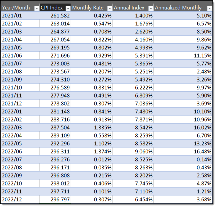
Finally, the Federal Reserve stepped in to try to lower inflation which by the beginning of 2022 had started to spike at over 1% month over month which if it continued for a year would imply over a 12% annual increase in prices (See the chart in Figure 1 below which lists the CPI (Consumer Price Index) values by month and shows what an annualized rate would be based on that month’s increase (which is a bias that assumes that what is true today will be true going forward) and what the increase over the prior year (year-to-year, a backward-looking bias) was. Of course, this is a lagging indicator. The sudden jumps in the monthly CPI due to the factors mentioned above as well as others gave the impression of runaway inflation. This continued as you can see through June 2022. Table 1 below shows the monthly CPI Index from the US Department of Labor. The next column shows the rate of increase from the previous month. The reported annual rate of inflation from the same month the prior year. Finally, the last column shows the monthly rate of change in the CPI multiplied by 12 which shows the inflation if the entire year going forward had the same rate as the current month.

Statistics from https://www.usinflationcalculator.com/inflation/consumer-price-index-and-annual-percent-changes-from-1913-to-2008/

Figure 1: Monthly CPI numbers from the US Dept of Labor Bureau of Labor Statistics

The Federal Reserve only has a single tool to fight inflation, which is to raise interest rates. So, inflation rates quickly rose 75 basis points each month for several months. (There are 100 basis points in 1%. Therefore, they were raising interest rates by 0.75% each month.) This interest rate is the amount that commercial banks can charge each other overnight for funds loaned to each other. Of course, this influences other interest rates from mortgages, to CDs, and even the Federal Treasury bond market. The way that this slows the economy and inflation is by making it harder for companies to borrow money to expand, to pay for raw materials, to pay rent, and even to pay salaries. While the Federal Reserve hopes that rising interest rates cool the economy by forcing companies to cut back on salaries and growth plans, it can also drive small businesses to close. This is where much of the fear of recession enters the picture as small privately held companies cannot obtain funds to help cover their expenditures as higher product prices discourage buyers of those products.

The result of this will be a shrinking of the economy, a consolidation of smaller businesses either directly or indirectly into larger businesses, increased unemployment, a slowing of wage increases, and in the extreme case a reduction in wages by those who just want to keep their jobs. How much will this affect the price of goods at the store? I don’t know other than some prices will retreat at least a bit. However, I have no hope for prices to fall back to what they were at the start of 2020.

Okay, for those of you who understand all of this, you are probably thinking that you are glad that you are not responsible for setting fiscal policy. I agree. But these were exceptional circumstances that started with what history may label ill-advised stimulus payments combined with what we hope was a rare health emergency. Of course, that is looking backward too. Perhaps if it had been foreseen that the Covid pandemic would not be as bad as many feared (on a percentage basis, the 1917-1918 Spanish Flu was far worse. See my post: Worse than the Spanish Flu?) or that vaccines would have been developed as quickly as they were, then a slower more cautionary approach to the situation might have been prudent.

While what was done is done, we may want to be sure that we do not overreact again as the inflationary spike falls back down. The fact is, for the last 6 months, the month-over-month CPI has retreated substantially and has recently dipped into negative territory. At the same time, the annual CPI number (which remember is backward looking) is dropping those high monthly CPI increases from the end of 2021 and the beginning of 2022. This tells us that the annual CPI number which the news constantly throws out as an indication that inflation is still too high is not only wrong but counterproductive. The important measure when there is a spike in any number is to look at the rate of change over a brief period of time. For this reason, I do not fear inflation at this point. Rather, we will experience some level of recession as the numbers settle back down due to FED policies as long as those who only watch the economy in their rear-view mirror do not overreact again and there are no more major bumps.

By sharepointmike Posted in Finance

They Were There All Along

How much of the rise in COVID-19 cases is due to the great increase in testing these last two weeks of 2021 as people rush to get tested before going to visit friends and family or to attend end-of-year parties? How many of the people who test positive have no symptoms or minor symptoms that they might otherwise have attributed to common cold or normal flu for this time of year? Could they have had COVID all along? I’m not sure I have the answer to those questions. However, I believe those questions should be asked to prevent any unnecessary fear from spreading through the population. Perhaps many of these cases are discovered in people who did not have symptoms. The authorities do not report whether the tests were conducted on people with symptoms. That’s too bad. However, what I can say is that we’ve all seen lines of people getting tested these last two weeks. Even here in Seminole County, Florida (just north or Orlando) we had an event the other day in which people lined up for literally miles to go to a local college to either get tested or to get a home test kit. It almost looked like an evacuation with clogged roads like a bad case of arterial cholesterol. At the same time, a few months ago, a similar event held at the same location was almost unattended.

Almost everything I’ve been hearing from major health organizations is that this mutation is not as severe as others, just more contagious. Again, I don’t know if that is inherently true or if it is because more people are vaccinated and therefore, even if they get COVID in their system, it cannot result in the severe symptoms that it might cause in unvaccinated people.

Finally, I want to add my sympathies to the death of Harry Reid at age 82. He was a Senate Democratic leader, but let’s put politics aside for the moment and honor this man who gave many years of his life in service to this country.

Worse than the Spanish Flu?

Here is a follow-up to my post from yesterday:

The Spanish Flu of 1918 killed between 20-40 million people worldwide and 675,000 Americans in 1918 out of a population of only 103 million Americans.  Today the United States’ population is 330 million which would translate into 2,162 million American deaths. The death count stands at 816,436 today. Thus, we would need to nearly triple the number of deaths to surpass the Spanish Flu death rate as a function of the population. In fact, if ‘only’ 1 in 250 Americans who get COVID die, we would need an additional 336 million people to get COVID to have the deaths surpass the equivalent Spanish Flu death count. That would mean infecting everyone in the US with COVID plus an extra 6 million that we don’t have. Let’s hope that is not a goal. Get vaccinated! Avoid crowds!

Ok, COVID is not funny, but isn’t it ‘fun’ to play with statistics?  

Misleading Pandemic Numbers Lack Context

Back in September, I posted an article about how bias can creep into your analysis. It was the basis for an SQL Saturday presentation I did in Orlando, FL in October. In that presentation, I used example from politics, climate change, rainfall, test scores, and of course, COVID-19.

Apparently, there are others around the country and the world that recognize that some of the hysteria people have every time a new variant of COVID hits the world (I said some, not all) is due to the way the data is presented. In a recent article written by Jim Downs for the Los Angeles Times and republished in the Sunday December 26, 2021 Orlando Sentinel, he explores the possibility that reporting just the number of new cases, or the number of deaths does not provide enough of a context as to what is really going on.

As an example from the past, he refers to a cholera outbreak in the early 1800s in India in which hospital workers treated patients with cholera without contracting the disease. If only the number of cases had been reported, the ‘average’ person might have been worried about contracting cholera from other people they meet in public. However, we now know that cholera was not transmitted by direct contact. That is why the hospital workers were not affected.

In fact, a little later in that century, another cholera outbreak led a London physician to the ‘discovery’ that most of the cholera cases could be traced back to water coming from a specific water pump. This basically means that understanding how a disease spreads and who gets infected and who does not could be important information to understanding the spread of any disease.

Mr. Downs states that understanding the uninfected as well as the ones who were infected but recover is equally as important as the other numbers that we typically see in the media. He mentions some of the same things I talked about in my presentation such as the rate of infections, not just the total number of infections over time. You see, the rate of infections determines whether the disease is growing or dying out. But it is more than that. Location is also important. We have seen in the recent Omicron variant where the rate of infection is growing rapidly in the United States, specifically the southern states while it appears to be abating in South Africa were it first appeared. Does this mean that it has run its course in South Africa? Does this give us information about how long a peak may last? As Mr. Downs says, “Reporting the number of infected is a numerator. We are missing the denominator.”

In my presentation, I clearly showed that the media attempts to portray California, Texas, and Florida as some of the worst states with the highest number of cases. However, these are also the three largest states in the United States by population. So, the real question should be, what is the number of case per 1,000 or even 100,000 people in each of these states compared to the US average. Even that however can be deceptive because the cases are probably going to peak at different times with the early peaks being in the Northeast and the latest peaks in the Southeast. This means that comparing rates per 100,000 people in any given week has a location bias. To really understand the situation, one needs to look at the rate during each state’s peak or after the peaks have died down, which they will, what the rates per 100,000 people were in each of the states from the beginning to the end of the Omicron or any other variant.

The same can be said of deaths, although here I prefer to look at deaths per 1,000 people who were infected and if possible, divide these into vaccinated and unvaccinated groups. Even that however, is not good enough. If a person is vaccinated on Monday, it can take several days, perhaps a week or more, for the vaccination to be effective. So, is a person who tests positive for Omicron on Thursday even though they were vaccinated on Monday really a vaccinated case or an unvaccinated case? Pointing to people who have been vaccinated just recently but then when out in a crowd they contract COVID may give people the wrong idea that vaccinations are totally worthless. Thus, the reporting as currently performed provides a disservice to public health promoting vaccination.

Keep in mind that I’m not saying that COVID or even the Omicron variant should be ignored or that it is a scam. Like Cholera, it is a real disease. But we need to avoid the bias of quick numbers that do not consider things like time, location, or even whether the victim recently was in large crowds (more than about 6-10 closely packed people). Should you use this to avoid going to work? In most cases, not at all. Even if your work puts you in contact with a large number of people in any given day, taking precautions like masks will probably keep you safe (Note: I have not seen any statistics on whether COVID victims are wearing masks around large crowds or not.) On the other hand, wearing a mask while driving alone in your car may be just as ridiculous as not wearing a mask in a large crowd.

Perhaps with just a small degree of common sense and concern about the health and welfare of not just ourselves, but those around us, we can make it through this. Remember this, “All Lives Matter”.


Has COVID-19 Reporting Caused a Bias in Public Opinion?

Recently I started putting together a presentation about how bias creeps into nearly every analysis of data out there. I maintain that the data itself cannot be biased, but the way that data is interpreted can add a conscious or unconscious bias. I also maintain that any analysis will have at least some degree of bias because the analyst is after all trying to make a point. However, it seems like the levels of bias have reached epidemic proportions since the beginning of 2020.

Of course, there has always been extremes in opinion over many issues. Typically, both sides present data to ‘prove’ they are right. That is what started me thinking, ‘Is there any way to remove/minimize bias from opinions and subsequently charts?’ Let’s first take a look at some of the differences of opinion that created some of the famous bias issues in the past.

Growing up in the 60’s, I was taught in school that continents never changed and always looked like they do today. However, I was fascinated by the then radical theory that South America sort of fit into the outline of Africa and that at one time the two were one land. Of course, today it is generally accepted that continents ‘float’ over the surface of the semi-molten mantle of Earth and in fact all of today’s land masses may have at one time been a single continent. Was this viewpoint a bias or just a lack of knowledge? I’m going to go with the latter.

Of course, who could forget the arguments about whether cigarettes caused cancer with each side creating arguments backed by charts to prove their point.

What about the moon landings in 1969 and the early 1970’s. I watched Neil Armstrong and Buzz Aldrin step onto the surface of the moon via a live television link. Yet many today still believe the moon landings were filmed in a Hollywood sound studio along with 2001, A Space Odyssey. Yes, they pointed at the flag ‘waving’ on a moon with no atmosphere and the lack of stars in the dark black sky. While there are perfectly reasonable explanations for these observations, they dismiss them as lies.

Similarly, it did not matter that while the astronauts were going to the moon that they could see that the Earth was a big rotating ball. Many believed, and some still do today, that the Earth is flat and that the images are just special effects.

Then there are those who believe that we are the only life (perhaps intelligent life although I question that some days) in the universe. Well, at one time people believed the sun revolved around the earth and furthermore that the Earth was the center of the Universe. However, astronomy has expanded our concept of the universe’s size and our latest telescopes like Kepler have already identified thousands of potential Earth-like planets circling the closest stars in our neighborhood. Although we have no evidence of life on these planets yet, the conditions appear to be favorable. But the bigger picture (no pun intended) is that the universe contains billions of galaxies each with billions of stars with billions of planets and many may be favorable for life, so why not? My guess is that there are billions of planets that have intelligent life on them, most are likely more intelligent than us.

But even if intelligent life existed somewhere out there in the universe, they say it could never cross the vast distances to reach us. Even the nearest star, Proxima Centauri is 4.24 light years away which is trillions of miles (nearly 25 trillion miles to be exact). It is only a century ago that most people believed that we could never get to the moon, a mere 238,855 miles on average, because it was just too far, and we did not have the technology to get there. Recently, the New Horizons space probe to Pluto made it past the moon after leaving Earth orbit in a little over 8½ hours. Even at that speed, a little over 28,000 mph, it would take nearly 890 million hours or over 97 thousand years to get to Proxima. Clearly, we need a warp drive or multi-dimensional travel.

These are all weighty problems, problems that science has been able to address which brings us to today’s biggest problem. No, not politics, the elections, or how to balance the national budget although those are areas filled with bias. Picking on politics would be like shooting fish in a barrel. No, I’m talking about COVID-19. From almost the beginning, the press has bombarded us with statistics about how bad COVID is and while there is no doubt that it has resulted in many people getting sick and way too many people dying, some still ask whether the numbers were reported fairly. Both sides of the argument have dug in their heels over the past year with sometimes conflicting statements proving their opinion was the correct one. Yes, there is plenty of data, but it all comes down to how the data is interpreted, reported, and presented to the people. Why? Because most people will not dig into the details to determine when statements contain a bias. However recently, I have seen some improvements. Take the following example.

Recently in the Orlando Sentinel newspaper it was reported that the number of deaths caused by COVID has now reached the number of deaths due to the Spanish Flu of 1918-19 in the United States with over 675,000 deaths. The reporter however did recognize that while that is true, the population of the United States is now about 3 times the US population of 1918-19. Unfortunately, he did not take it one step further to emphasize that the deaths from COVID is only a third of the deaths from the Spanish Flu on a per capita basis. Yes, still serious, but at this time the comparison to the Spanish Flu is not a one-to-one comparison. Yet most people will only remember the headline that the number of COVID deaths has reached the number of Spanish Flu deaths. He also went on to state that global deaths from Spanish Flu were about 50 million while global deaths from COVID are only about 4.7 million at the time of this writing (confirmed with data from the CDC – WHO – ECDC). Let’s twist the Rubric Cube a quarter turn. Using the 675,000 U.S. deaths, the United States accounts for 14.67% of the global deaths today while the U.S. only accounted for 1.35% of the deaths globally from the Spanish Flu. That is an amazing statistic. It should lead the thinking person, like you and me, to ask why is the percent of the global deaths in the United States so much higher for COVID than it was for the Spanish Flu?

Sorry, I do not have a definitive answer, but I do have some clues. The Spanish Flu is known to have killed mostly young healthy adults. On the other hand, a large percentage of the COVID deaths come from the elderly defined as the 65+ group and people with underlying conditions. Since the rest of the world also has a growing group of elderly, it cannot be that simple. What else could it be? Could the higher percentage of deaths due to COVID in the United States indicate that Americans are basically less healthy than the rest of the world and thus more likely to get seriously ill from COVID? Or were at least some of the deaths attributed to COVID really the result of other underlying illnesses that were complicated by COVID?

In related news, according to data published on the CDC website and published by the Denver7 24/7 news channel, the number of confirmed flu cases between September 27, 2020 and May 15, 2021 was only 2,124. To put that number into perspective, the CDC reported on their website that 38 million influenza cases, 18 million medical visits, 405,000 hospitalizations, and 22,000 deaths occurred in the 2019-2020 flu season, just one year prior. In fact, digging into the CDC data shows that the number of deaths due to the ‘common’ flu averages between 12,000 and 61,000 Americans each year. Again, while any number can be seen as too high, the point of this comparison is the exceptionally low number for the 2020-2021 flu season. Maybe the regular flu did not spread because people stayed home and wore masks in public.

Another interesting fact is that while the Federal government promotes vaccination in Americans, there is no mandate for vaccinations such as there was for smallpox, polio, measles, mumps, and rubella to name just a few (see the CDC for a complete list). Each state has slightly different rules especially concerning exemptions, but most states require specific vaccinations before a child can begin school. Initially the shots from Pfizer, Moderna, and Johnson & Johnson were approved for emergency use which may have justified not imposing a public health mandate. However, as these drugs received approval, the drive to reach ‘herd’ immunity faltered yet mandatory vaccination was not implemented. Perhaps people were still afraid of a drug that had only recently received full CDC approval. In any case, President Biden apparently has enough faith in the Pfizer drug to pledge one billion doses to other nations. The Earth currently has about 7.7 billion people so two doses per person will not cover everyone. But here is another interesting twist of the Rubic Cube.

The Federal government decided recently to cut the number of Regeneron (a monoclonal antibody treatment to help reduce symptoms in people with early stage COVID infections) doses to the state of Florida. In the same time period, Florida had the 4th highest death total for COVID in the United States since the beginning in March 2020, however, it is also the third largest state in population dropping it to 11th in deaths per 1000 people. Still, it tried to order 72,000 doses per week and needs at least 36,000 doses to supply state clinics, yet the Federal government cut the number of doses to Florida to under 30,000. With a 7-day average of over 8,000 new cases per day (over 56,000 per week) and over 320 deaths per day, 30,000 doses per week do not seem to be enough. Currently, only Texas has more daily cases. Perhaps the demand is so high that doses must be rationed or perhaps it was because Florida as a state voted Republican in 2020. Who knows?

In another question of ‘who is driving the bus’, the Federal government through President Biden has mandated that all employers of 100 or more employees must be vaccinated or get a weekly negative test result. When many of the testing sites take 4-5 days to return a test result one might ask, what is the point? Yes, the Abbott Labs at-home test kit, BinaxNOW, can provide 15-minute results, but they cost a little over $10 per test that you will have to pay out of your pocket. Furthermore, they appear to be in short supply. Anyway, at the same time, there is no requirement for vaccinations of customers and furthermore, you cannot ask a customer if they are vaccinated. In fact, the Department of Health says they will fine businesses and government groups $5,000 per violation for requiring customers to show proof of COVID vaccination. How can you require vaccines for employees but not apply the same standards to customers? Seems like a bias to me or at least some confusion as to who is driving the bus.

One last point as this post has already gotten too long. Some doctors say the solution is vaccination and masks while others like the new Surgeon General for the State of Florida call vaccinations a religion and that people should just lose weight and eat more fruits and vegetables. So, if vaccinations are a religion, does the refusal to get a vaccine shot amount to a religious exemption? Going back to a prior point, is the Surgeon General trying to imply that Florida’s high death rate is because too many citizens are obese, out of shape, and eat too much fast food?

Anyway, this should give you something to think about the next time you hear the media quote numbers or percentages. Use your own common sense. Seek out the actual data. Population data and COVID case and death numbers are easily available online. Remember that the data itself is not bias. However, the way people interpret and report on the data often does insert a bias. Do your own math. It is really that simple. Remember that while bias in the presentation of data sometimes leads to a better understanding of what is going on, that is not always true. You need to educate yourself on the issues and that does not mean following social media, even this one, blindly. Even the biggest lies have some truth in them to make them believable and even honest people can sometimes interpret that unbiased data wrong.

My SQL Saturday presentation at the end of October here in Orlando will examine bias in data charting and how bias can be used to make a point or disguise reality.

By sharepointmike Posted in Opinion

Fixing Color Contrast Issues

One of the more common compliance issues with ADA (Americans with Disabilities Act) is also one of the easiest to fix. Color contrast in relation to the text on the background requires that the text be easy to read by all users who access your website visually. Color contrast measures the difference between the font color and the background color on which the font is placed. The rule is quite simple:

  1. Text consisting of a font that is greater than 14 pt bold (19 px) or 18 pt normal (24 px) must have a 3:1 contrast ratio with the background on which the font is displayed.
  2. All other smaller text must have a contrast ratio of 4.5:1.

How do you calculate the color contrast between your font text and its background? You don’t need to know how to perform the calculation. There is a free tool that you can download and keep open on your desktop at all times so you can check the color contrast of everything you create. It was created by The Paciello Group and can be downloaded from this URL: The Paciello Group website – Colour Contrast Analyser.

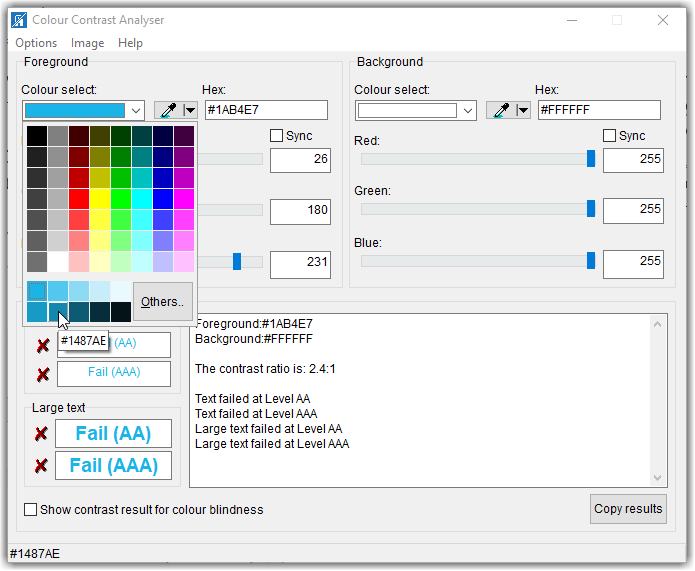
But if the color contrast is not sufficient, how do you fix it. Well, of course, you try randomly selecting different colors, shades, hues, or tints of the original color until this tool calculates a satisfactory contrast ratio. For example, suppose the Colour Contrast Analyser was looking at a light blue (Hex: #1AB4E7) font on a white background (see image below). The initial colour contrast ratio is 2.4:1 which is too low even if the text was larger. You might think that the light blue on white looks good to you. However, you are not everybody and some people have more difficulty with colors than others. Thus, the Americans with Disabilities Act had to create a set of rules that were testable and verifiable to ensure a contrast that most people would find the resulting text to be easy to read against the background.

One way to ‘fix’ the problem is the click the dropdown arrow to the right of the box that displays the color which opens a grid of different colors as well as several different tints (adding white) to the base color and shades (adding black) to the base color. Because we want to increase the color contrast, we would perhaps try some of the shades. In the image below, the mouse is pointing to the second shade in the second (‘Shades’) row which has a hex value of #1487AE.

Colour Contrast Analyser dialog showing how you can test the contrast of other color combinations

However, even this shade of blue is not dark enough to contrast with the white background resulting in a value of 4.1:1. Good enough for larger text, but if the text is smaller, it still falls below the 4.5:1 requirement. We could go back to select the middle box (#0D5A74) which results in a great contrast of 7.7:1. However, it may be too dark. I am not going to go through the trial-and-error steps here of going back and forth between lighter tints and darker shades until you find one that just satisfies the 4.5:1 rule without deviating too much from your original color. Rather, I am going to introduce you to a second tool that can help you find a satisfactory color without all that trial and error.

The tool that I found is called the Tanaguru Contrast Finder. This tool, while free, is not something you need to download. Rather just go to the Tanaguru home page for the contrast finder.

Open the Tanaguru site to use the Contrast Finder tool

This tool’s home page lets start by specifying both the initial foreground (1) and background (2) colors. You can specify these colors either using the decimal values of the RBG color definition or you can enter the hex value of the color

Defining your foreground and background colors in the Tanaguru Contrast Finder

Next, you can select the minimum colour contrast ratio you must meet (3). If the text is smaller, select 4.5 as shown below. For larger text, select 3.1

Defining your contrast ratio goal and what you will allow the program to change to meet that goal

You can then select which color you want to change (4). In the case of regular text on the web page, you generally want to keep the page background color consistent across all of your pages. Therefore, I would change to the Edit the foreground color option.

You can also ask for colors that are very close to the initial color or a range of valid colors(4). I would in most cases go with a valid color very close to the initial color unless the contrast is too far from the ideal value in which case, I might ask for a range of valid colors to pick from.

When all the settings (1-4) are complete, click the Check and find contrast button (5). This is where the magic occurs.

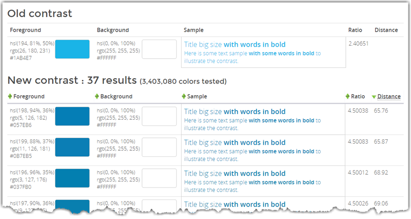
After clicking the Check and find contrast button, the bottom half of the page is filled with possible colors that meet or exceed the color contrast you selected.

Output from the Tanaguru Contrast Finder of recommended colors to meet your contrast goal

First, it shows the original foreground and background colors to give you a reference. To the right, there is a sample of the text so you can see what it would look like on a web page followed by the calculated contrast ratio.

Beneath the original colors, you see the possible colors the algorithm has selected. Even if they all look a little similar to you, the actual RGB values displayed in the leftmost column show that these really are different shades of blue. Note that the ratio column shows a calculated ratio of 4.5 or greater for each of the color combinations.

What I find instructive in training your eye to spot questionable color contrast text is to focus on the sample text from about 4-5 feet away. No matter how good your vision may be, you will often see a significant difference between the original colors and the selected colors, especially in this case.

Another example is the following image fragment from a web page I ran across. The first thing that my eye picked up was the green text on the white background. Indeed, this combination is only 2.5:1. However, not as obvious to most web page editors is that the red used in this table also has a low contrast to the white background. While it is better than the green, it still is only 4.0:1 which is below the required color contrast ratio of 4.5:1.

Example of low contrast text colors on a white background.

In fact, this shade of red is often picked out of a grid of colors as shown in the font color grid within the editor. As shown below, a pure red that also has the RGB value of (255,0,0) may seem at first to be a good choice because it may appear to be a bright red on a white background. Note, however, that bright colors often have poor contrast on a white background but may work fine on a dark background. Keep this in mind: the color selection dialogs in almost all cases have no idea what the background color will be. Therefore, it displays a range of colors, some of which may work with your background color, and many that will not. It is your responsibility to determine if the resulting color contrast with the background color is acceptable.

Typical color grid for selecting a font color

In this case, the darker red to the left (#C00000 or RGB(192,0,0) actually provides a good contrast with white resulting in a contrast ratio of 6.5:1. Don’t even get me started on orange on white or even worse, yellow text on white

When you have text on a colored background such as the image shown below, the situation is much more complex because you can tweak both the font color and the background color to achieve the desired contrast ratio. (Yes, even text in images must meet the color contrast rules stated previously.) In this image, the yellow on the blue text has a ratio of only 2.1:1, the white font on a blue background is a ratio of only 2.4:1, the blue text on beige is only 2.2:1, and the red-orange on beige is a mere 1.6:1. I’m not even going to get into the effect on the crispness of the text when the image size is changed as was done here.

Colored text on different colored backgrounds

In a case like this, if you have access to the original graphic and can change the colors before you post the image, you must do that. Even if the image comes from a third party as is probably the case in this image, you cannot pass responsibility back to the third-party and use the image anyway. Either they must supply an image that satisfies ADA guidelines, or it cannot be used on your site.

Furthermore, this image contains substantial text that the vision impaired using a screen reader will not be able to ‘read’. Therefore, the text must either appear in the alt-text of the image or if there is too much text there (generally alt-text should be less than 160 characters), then the text should be elsewhere on the page or on a separate page linked from the ‘longdesc’ field of the image. In this case, to ensure ADA compliance, I would probably not use the image and just enter the text manually in a content portlet for the page.

In general, when looking at your page, you must consider people with all types of accessibility challenges such as:

  • Visitors with low color contrast vision.
  • Visitors who use screen readers to read the page contents.
  • Visitors who have low hearing ability should your page use sound or voice.
  • Visitors who cannot use a mouse to navigate around the page.
  • Visitors who are affected by flickering images from animated gifs.

Putting yourself ‘inside the heads’ of all of these different visitor types is a challenge, no doubt. However, it is what is required of an accessible web page.

One last point, all of the above applies not only to websites but to any content you make available to others within or outside of your organization because you just don’t know what challenges they may face.  It simply is the right thing to do.

By sharepointmike Posted in ADA